Choosing among illustration techniques can feel overwhelming when you are starting out. The core set is small: gesture, line, shading, perspective, composition, colour and light, learned roughly in that order.
| Item | Key fact |
|---|---|
| Chiaroscuro | Italian term meaning light-dark |
| Chiaroscuro example | Joseph Wright of Derby, An Iron Forge (1772) |
| Linear perspective | Invented in Italy in the early fifteenth century |
| Vanishing point | Where receding parallel lines appear to converge |
| Complementary colours | Pairs that contrast more than any other colour |
Definitions come from Tate’s chiaroscuro entry and Tate’s perspective entry. Glossary wording can be revised, so check the sources before you rely on them.
What illustration techniques actually cover
An illustration technique is a repeatable method for solving one visual problem. How do you show a body in motion? How do you make a flat shape look round? How do you make a room feel deep? Each question has a classic answer, and most of those answers are older than any software.
This guide groups the methods into a working order. You start with movement and structure, move to form and light, then to space, arrangement and colour. Each section points to a deeper guide on the site for the topic in question.
The same methods apply whether you draw on paper or on a screen. If you work digitally, our guide to digital painting covers how these ideas translate to layers and brushes. Tool choice matters less than most beginners think, though our overview of digital art software can help you compare options.
Illustration also overlaps with game and film design. If your goal is to design characters, props and worlds for production, the related field of concept art leans on exactly the same core techniques, with more emphasis on speed and idea exploration.
Here is the sequence this article follows:
- Gesture: capture the energy of a pose or shape.
- Line: control the edges that describe your subject.
- Shading and light: turn flat shapes into believable form.
- Perspective: place objects in convincing space.
- Composition: arrange the picture so the eye goes where you want.
- Colour: set mood and unify the image.
Gesture and line: the foundation of every drawing
Most weak drawings fail early, before any rendering begins. The pose looks stiff, the proportions drift, or the edges feel nervous. Gesture drawing fixes the first problem by forcing you to draw the movement of a subject rather than its outline.
Gesture drawing
A gesture is a fast, loose mark that captures direction and rhythm. You draw one long curve for the spine, a few more for the limbs, and you ignore details such as hands and faces. The goal is energy, not accuracy.
Our guide to gesture drawing walks through timed exercises in more depth. A useful habit is to vary the time you allow yourself, from very short poses to longer studies, so that you learn both speed and restraint.
Gesture also works beyond figures. Trees, animals, cloth and even buildings have a main direction of flow. Finding that flow first gives your later line work a reason to exist.
Line work
Once the gesture is down, you refine it into clean edges. Line is not neutral: a thick, confident stroke reads as close and heavy, while a thin, broken stroke reads as distant or delicate. Controlling that variation is called line weight.
Our page on line art techniques covers inking, line weight and clean-up in detail. Practise long, smooth strokes from the shoulder rather than short strokes from the wrist, because short strokes tend to wobble.
A few common line habits are worth building:
- Draw through forms: sketch the hidden side of a shape so it sits correctly in space.
- Vary weight: heavier lines under shapes and in shadow, lighter lines on the lit side.
- Let some edges disappear: not every edge needs a line, and lost edges add atmosphere.
Shading and light: giving flat shapes volume
A drawing with good line but no tonal structure looks like a coloring page. Shading adds the information about where a form turns away from the light. Our guide to shading techniques covers hatching, blending and soft rendering one by one.
Think in simple light and shadow shapes
Before you add gradients, divide the subject into two groups: the lit side and the shadow side. Squinting at your reference helps, because it removes small detail and leaves only the big value shapes. If the big shapes read clearly, the picture will hold up even when the rendering is rough.
Then add the middle steps. A lit form usually has a highlight, a light tone, a core shadow where the surface turns away, and often a soft bounce of reflected light along the shadow edge. Keeping the core shadow darker than the reflected light is what makes a sphere look solid rather than flat.
Chiaroscuro and dramatic contrast
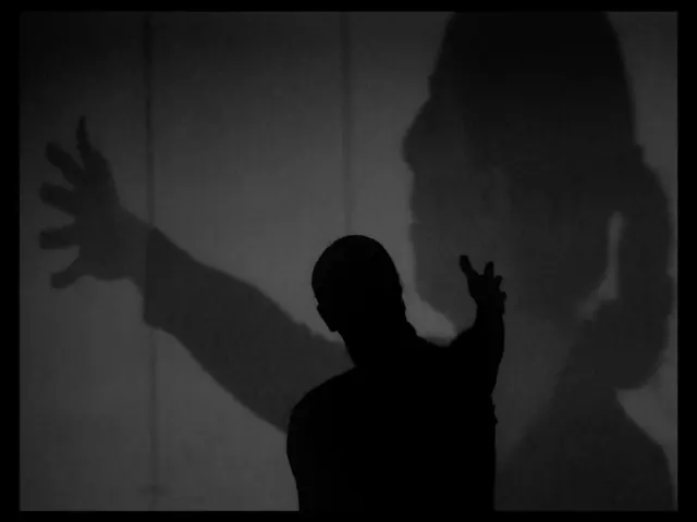
The classic term for strong light and dark contrast is chiaroscuro. According to Tate’s art terms entry, it is an Italian term which translates as light-dark, and it refers to the balance and pattern of light and shade in a painting or drawing. Tate illustrates the idea with Joseph Wright of Derby’s An Iron Forge (1772), a picture lit by a single glowing source.
For an illustrator, the lesson is practical. A limited number of strong darks, placed with care, can carry a whole image. If you want a scene to feel tense, mysterious or intimate, push the contrast and let large areas fall into shadow.
Light as a design tool
Shading describes one object; lighting describes the whole scene. The direction, colour and hardness of the light decide the mood before any story is read. Our guide to lighting in illustration compares front, side, back and rim lighting and shows what each does to a subject.
As a rule of thumb, side light reveals form best, back light creates silhouettes and drama, and flat front light hides form but simplifies the image. Choose the light on purpose, not by accident.
Perspective and composition: building space and attention
Form and light make single objects believable. Perspective and composition make the whole picture work as a space and as a design. They are different skills, but they solve linked problems: where things are, and where the viewer looks.
Perspective drawing
Tate describes perspective as the representation of objects in three-dimensional space on the two-dimensional surface of a picture. Linear perspective rests on the fact that although parallel lines never meet, they appear to do so as they get further away. As Tate’s perspective entry explains, linear perspective was invented in Italy in the early fifteenth century and first developed by the painter Paolo Uccello.
The anchor of the system is the vanishing point. Tate defines the vanishing point as the point at which receding parallel lines viewed in perspective appear to converge. Our guide to perspective drawing shows how to set up one-point, two-point and three-point grids step by step.
Perspective also has an atmospheric form. Tate notes that aerial perspective creates the sense of distance in a painting by utilising the fact that the atmosphere appears more blue in the distance. In practice, you push distant objects toward lighter values, lower contrast and cooler colour.
Composition
Composition is the arrangement of shapes, values and edges within the frame. A strong arrangement has one clear focal point, a path for the eye to follow, and enough variety that the picture does not feel static. Our guide to composition in illustration covers framing, balance, leading lines and the rule of thirds.
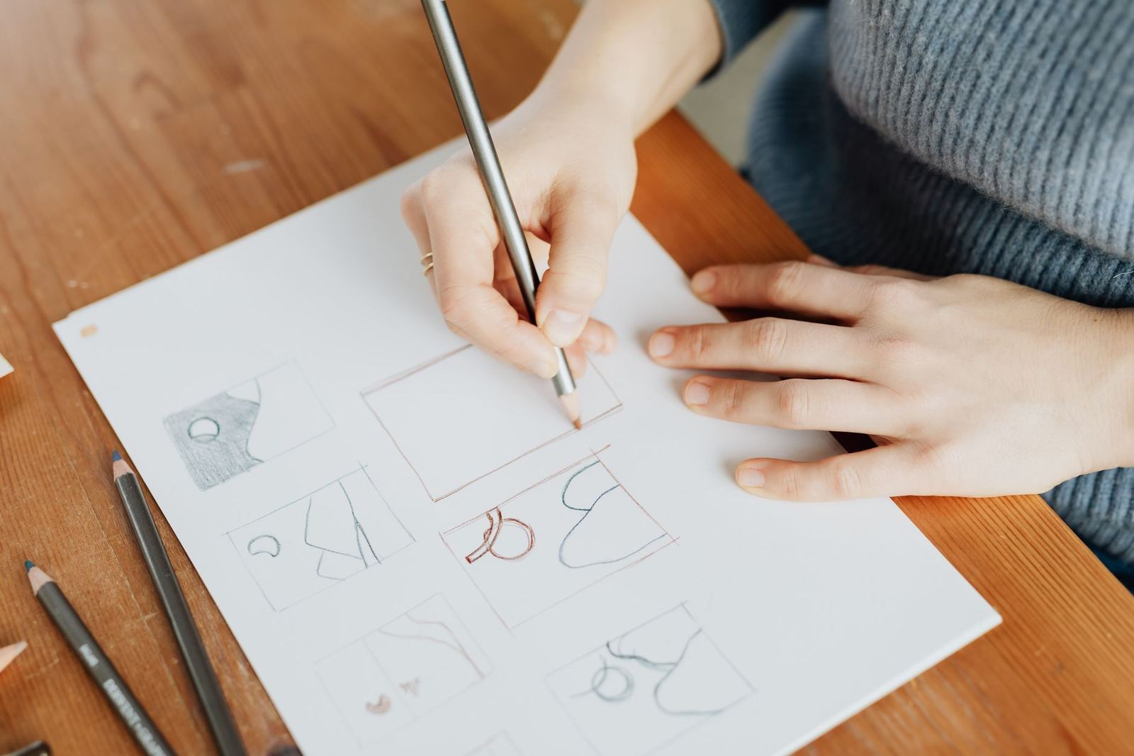
Before committing to a final drawing, try several quick thumbnails. Thumbnails are tiny sketches that test different arrangements in a few seconds each. Most compositional problems are cheaper to fix at that stage than after you have rendered the details.
A short checklist for a first composition review:
- Is there a single focal point, and does the highest contrast sit there?
- Do lines, edges or gazes lead toward that point?
- Is any important shape cut awkwardly by the edge of the frame?
- Is there a quiet area where the eye can rest?
Colour: mood, harmony and contrast
Colour is usually the last decision and the first thing a viewer feels. Many illustrators plan values in greyscale first, then add colour on top, so that colour never has to carry the structure by itself. That separation makes colour mistakes easy to correct.
Our guide to color theory for illustration goes deeper into palettes, temperature and saturation. A few ideas are enough to start with.
Complementary colours
Tate’s entry on complementary colours describes them as pairs of colours that contrast with each other more than any other colour, and when placed side by side make each other look brighter. They sit opposite each other on a colour wheel. Using a complementary pair, such as a warm orange accent against cool blue surroundings, is an easy way to create a focal point.
Restraint beats variety
Beginners often use every colour they can find. A better approach is to pick a dominant hue, a secondary hue and a small accent, then vary their value and saturation. Limited palettes tend to look unified, and they make the accent colour stand out.
- Warm and cool: warm light usually pairs with cool shadow, and the reverse.
- Saturation: keep your strongest chroma for the focal area.
- Value first: If a colour image works in greyscale, preserving its value relationships when changing the palette can help maintain readability.
Common mistakes and how to fix them
Most problems in an illustration trace back to one missing fundamental. Learning to diagnose the cause can help you focus your practice. The list below pairs frequent symptoms with the technique that usually cures them.
- Stiff figures: the pose was drawn from outlines. Return to gesture and find the main curve before adding any shape.
- Flat, cut-out look: there is line but no tonal plan. Block in the lit and shadow shapes first, then refine.
- Muddy colour: too many hues at similar values. Reduce the palette and let value do the structural work.
- Objects that float: the contact shadows are missing, or the perspective lines disagree. Check the horizon and add a dark accent where objects touch the ground.
- Busy, confusing images: every area has equal contrast. Choose a focal point and calm everything else.
Over-rendering too early
A common habit is to polish one corner of the picture while the rest is still a rough sketch. The polished area then sets a standard the rest cannot match, and a flawed overall structure remains hidden until late. Work from the whole to the part: big shapes first, medium shapes second, small details last.
A useful test is to stop at each stage and ask whether the image would already communicate its idea if you had to stop there. If it would not, more detail will not rescue it. Fix the larger structure while it is still cheap to change.
Relying on reference without understanding it
Photographs are excellent teachers, but copying them line for line trains your eye to trace rather than to see. Use reference to check facts, such as how a joint bends or how light wraps a form, and then draw from your understanding of the structure. Over time you need less reference, because the underlying rules begin to feel familiar.
Mixing sources also helps. A pose from one photo, lighting from another and a palette from a third forces you to make decisions instead of transcribing. That decision-making is the real skill an illustrator is building.
Choosing media and workflow
Every technique above can be practised in graphite, ink, gouache, marker or digital paint. Each medium has its own habits, and trying a few widens your understanding of values and edges. Traditional media punish careless marks, which makes you think before you draw. Digital media encourage experiment because mistakes are cheap to undo.
Pick the medium that lets you practise most often. A sketchbook that lives in your bag will teach you more than a perfect setup that you rarely use. If you do work on a screen, set up a simple, consistent file routine: a rough layer for gesture, a layer for line, and separate layers for flat values and colour.
A staged workflow for finished pieces
Many professional illustrators follow a similar order, whatever the medium. Following the same order each time makes your process dependable, and it makes it easier to see where a problem started.
- Thumbnails: explore the idea and composition in tiny sketches.
- Rough drawing: set gesture, proportion and perspective.
- Value study: decide where the lights and darks go.
- Line or refined drawing: define the edges that matter.
- Colour: apply the palette over the value structure.
- Final polish: sharpen the focal area and soften the rest.
You will not always need every stage. A quick sketch may stop at the rough drawing, while a detailed poster may revisit several stages more than once. The point is that each stage answers a different question, so you never try to solve everything at the same time.
Building a practice routine that sticks
Knowing the techniques is different from owning them. Skills develop through short, focused repetition, not through occasional marathon sessions. The most useful plan is one that you will actually follow on a tired weekday.
One simple weekly structure is to give each session a single target:
- A gesture warm-up, drawing quickly from photos or life.
- One focused study, such as a sphere in side light or a street in perspective.
- One small finished piece that combines what you practised.
- A short review where you compare the result with your reference and note a single thing to improve.
Studying master drawings and paintings is also valuable. Look at how an artist handles edges, how few values a picture really uses, and where the strongest contrast sits. Copying small sections of a work for study is a traditional way to learn, as long as you do not present the copy as your own original.
Finally, keep your studies. A folder of dated drawings shows progress that you cannot feel from day to day, and it points to the weakest area to work on next.
Frequently asked questions
Which illustration technique should I learn first?
Show answer
Start with gesture and basic line control, because they train your eye and hand together. Add simple shading once your shapes feel convincing, then move on to perspective and composition.
Do I need expensive tools to practise these techniques?
Show answer
No. A pencil and paper are enough to practise gesture, line, shading, perspective and composition; colour exercises also require coloured materials or digital tools. Software mainly adds convenience, such as layers and undo, not new fundamentals.
Is digital illustration different from traditional illustration?
Show answer
The principles are the same: form, light, space, arrangement and colour. What changes is the workflow, since digital tools let you adjust values and colour non-destructively.
How do I know which technique is holding my work back?
Show answer
Look at a drawing in greyscale and from a distance. If the shapes read poorly, work on shading and composition; if the figure feels stiff, return to gesture; if the space feels wrong, revisit perspective.
Can I learn illustration techniques from art history?
Show answer
Yes. Museum glossaries and collections explain the vocabulary, and historic works show the methods in action. Analyse them, and use copies as study exercises without presenting them as your own originals.