Wobbly, scratchy lines can make a good sketch look unfinished. The most useful line art techniques are varying line weight, drawing from the shoulder, and cleaning up with intent.
| Item | Value |
|---|---|
| Line properties that make up line weight | Thick or thin, light or dark, soft or sharp |
| Common misconception | Line weight is assumed to be the same as thickness |
| What a heavy contour does | Emphasizes the shape of the object it surrounds |
| What controlled line weight can show | Importance, form, depth, and a sense of shadow and light |
| Shading needed for that effect | None |
The figures come from Proko’s line weight lesson notes. Teaching pages get revised, so check the source before you rely on them.
What clean linework actually means
Clean does not mean perfectly smooth or mechanical. It means every line looks deliberate: it starts where you meant it to, ends where you meant it to, and carries a reason for its weight.
Many beginners chase smoothness and end up with stiff, lifeless outlines. Confident lines are usually drawn in one quick motion, even if they are slightly imperfect.
Think of linework as three separate decisions:
- Placement: where the line travels and how it describes the form.
- Weight: how heavy, dark or sharp the line is.
- Ends: how the line begins, tapers, overlaps or closes a corner.
Good placement starts before the ink. If your sketch has weak structure, polishing the lines alone may leave those structural problems unresolved, so it helps to loosen up first with gesture drawing before you commit to final lines.
Line weight is more than thickness
A common assumption is that heavy means thick. The lesson notes say “Now typically people assume that line weight is the same as line thickness.” The same notes explain that lines can be thick or thin, light or dark, soft or sharp, and the mix of those properties gives a line its weight.
That gives you more controls than width alone. A thin but dark line can read as heavier than a wide, pale one.
The payoff is large. According to the same lesson, by controlling line weight you can organize the importance of elements, show form and depth, and suggest shadow and light without any shading.
Practical ways to use weight
- Outer contour heavier than inner detail. A heavy contour emphasizes the shape of an object, so it separates the subject from its surroundings.
- Heavier lines where shapes overlap or sit in shadow. This can clarify overlaps and suggest shadow, weight and contact.
- Lighter lines for small details and distant objects. Detail stays readable without competing with the main shapes.
- Consistent weight when you want a flat, graphic or technical look. Variation is a choice, not a rule.
Once your lines carry form on their own, the next step is adding tone. Our notes on shading techniques show how line and value can work together instead of repeating each other.
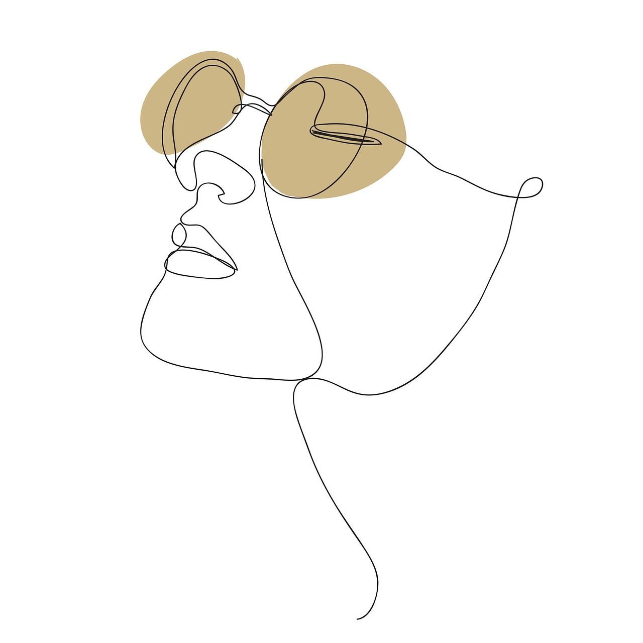
Drawing confident strokes
Hesitation can contribute to shaky lines. Slow, careful strokes tend to wobble, while a committed stroke made at a steady speed usually lands cleaner.
Try this routine before every inking session:
- Warm up with straight lines, curves and ovals on scrap paper or a spare canvas layer.
- Rehearse each stroke in the air above the page, then draw it in one motion.
- Move from the shoulder and elbow for long lines, and from the wrist for short curves.
- Turn the page or canvas so the stroke always falls in your most natural direction.
- Redraw a line instead of patching it with many tiny corrections.
Pull the stroke rather than push it, and let the line taper at the end by lifting the pen as you finish. A tapered end feels quick and alive, while a blunt stop can feel mechanical.
Handling corners, overlaps and gaps
Where lines meet is where linework most often looks messy. Decide on a habit and apply it consistently.
- Closed shapes: let lines overlap slightly at corners for a sketchy, energetic feel.
- Tight joins: stop the stroke exactly at the corner for a crisp, polished look.
- Intentional gaps: a small break in a contour can suggest light hitting an edge, but keep gaps small so shapes still read as closed.
Avoid short, sketchy, repeated strokes along a single edge. They create a hairy, uncertain look. One longer line usually says more.
Digital and traditional cleanup
In traditional work, pencil first and ink second is the usual route. Let the ink dry fully, then erase the pencil, so you do not smear the work.
Digital tools add forgiveness. Most drawing programs have a stabilizer or smoothing setting that averages out hand jitter. Keep it modest, because heavy smoothing makes curves lag behind your pen and flattens the natural variation that gives lines character.
Some programs also offer vector layers, where you can adjust line width and fix points after drawing. That helps with tapers and corrections, but the same principles apply: plan your weight, draw with a committed stroke, and keep the style consistent across the piece.
A few habits keep digital lines tidy:
- Work on a separate line layer above your rough sketch.
- Lower the sketch opacity so it guides you without distracting you.
- Zoom in to check joins, but zoom out often to judge the whole image.
A simple practice plan
Small, repeatable exercises can help you develop your skills. Redraw one old sketch using deliberate weight, then compare it with the original.
Next, draw a simple object such as a stack of books. Use a heavy contour around the whole group, then try again with a heavy contour around each book separately, and note how the grouping changes. This mirrors the lesson’s point that a heavy contour unites or separates what it surrounds.
Finally, set a rule that fits the project. Comics often suit bold variation, while technical or clean design work often suits even lines. Pairing this practice with other illustration techniques will help your linework fit into a complete workflow.
Frequently asked questions
Is line weight the same as line thickness?
Show answer
No. The Proko lesson notes say lines can be thick or thin, light or dark, soft or sharp, and the way you combine these properties conveys line weight.
Can linework show light and shadow without shading?
Show answer
Yes, to a degree. The same lesson says controlled line weight can suggest depth, shadow and light without shading.
Should I use a stabilizer for digital line art?
Show answer
It can help, but use a modest setting. Too much smoothing makes your lines lag and look stiff.
How do I stop my lines from looking shaky?
Show answer
Rehearse the stroke, draw it in one committed motion from the shoulder or elbow, and redraw it instead of patching it.