Starting digital painting can feel like a wall of menus and brushes. You only need a tablet, painting software and a few habits: set up the canvas properly, work in layers, and keep your tools simple.
This guide sits within our wider look at illustration techniques.
| Item | Value |
|---|---|
| Canvas resolution for print | 300 (pixels per inch) |
| Canvas resolution for screen only | Pick pixel dimensions that suit the screen; the PPI setting alone does not shrink the file. |
| Starting color mode | RGB |
| Minimum gear | A graphics tablet and painting software |
| Panels to learn first | Brushes, Layers and Color |
These figures come from Paintable’s beginner guide. Software defaults and advice can change, so check the source and your program’s documentation before you rely on them.
What digital painting actually asks of you
Digital painting uses the same fundamentals as traditional painting: shape, value, color and edges. The software only changes how you apply them. Nothing dries, so you can work faster and rework more freely.
According to the same guide, “The only things you need to get started with digital painting are a graphics tablet, and painting software of your choice.” A screen tablet is optional, and you can add one later if you stay with it.
Treat the first weeks as practice in seeing, not in tools. A simple study of a mug or a tree teaches more than a long hunt for the perfect brush.
Set up your canvas before the first stroke
Most beginners open a canvas at whatever size the software suggests. A few minutes of setup avoids blurry prints and slow files later.
- Size: set width and height in the units you think in, then check the pixel dimensions.
- Resolution: choose it by where the work will end up.
- Color mode: begin in RGB, which suits screens.
The guide advises that “If you’re planning to print your artwork, use 300” pixels per inch. For screen work, choose suitable pixel dimensions; changing PPI alone does not reduce file size. On color, its rule is “Always start in RGB.”
If you are unsure, start larger. You can shrink a painting without much harm, but enlarging one makes it soft.
Learn layers as a safety net
The guide calls layers “one of the most useful features of digital painting, if you know how to use them.” The idea is simple: keep elements separate so a change to one does not wreck the rest.
It puts it this way: whether it is an object, a body part, a highlight or a shadow, painting them on different layers gives “the ability to tweak each element without risking the rest of your work.”
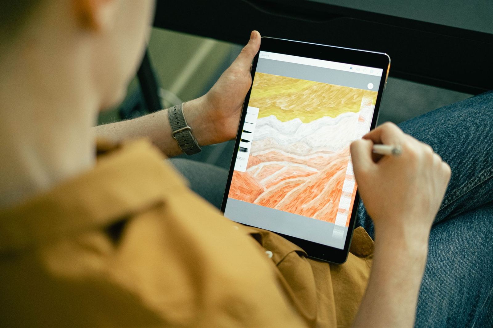
A sensible beginner stack looks like this:
- A sketch layer at the bottom, kept light.
- Flat base colors on their own layer.
- Shadows and highlights on separate layers above.
- Final details on top.
Name your layers as you go. A file full of layers called “Layer copy” becomes hard to edit when you return to it later.
Group related layers into folders once a piece grows. Hiding a folder lets you judge how the painting reads without distracting details.
Keep a lightweight habit of saving versions. When a painting goes wrong, an earlier file lets you step back without losing everything.
Keep brushes and shortcuts minimal
The guide suggests starting with the Brushes, Layers and Color panels only. Ignore the rest of the interface until you need it.
A small kit does the job for most studies:
- A hard round brush for shapes and edges.
- A soft brush for gradients and blending.
- A textured brush for rough surfaces.
The guide also says you should “start to get familiar with using keyboard shortcuts” to speed up your workflow. Undo, brush size, and switching to the eraser are the ones to learn first.
Build habits that make you improve
Good habits matter more than gear. Work from big shapes to small ones, and zoom out often so you judge the whole picture, not one corner.
Check your values early by looking at a grayscale version. If the image reads clearly without color, the colors will have a solid base to sit on.
Once the basics feel natural, two useful topics to explore are lighting and color theory. Read about lighting in illustration to place light and shadow with intent, and see color theory for illustration to choose palettes that hold together.
Keep your posture and pen grip relaxed, and take regular breaks from the screen. A relaxed grip and comfortable arm movement may help you draw more fluid strokes.
Review your older work now and then. Seeing how far your shapes and edges have come is the best motivation to keep going.
Finish small pieces rather than abandoning large ones. Each completed study teaches you something a half-done epic cannot.
A simple practice routine for beginners
Short, repeated sessions beat rare marathons. Pick one small subject and aim to finish it in a single sitting, even if the result is rough.
Try this sequence on each study:
- Block in the main shapes with a hard round brush in a single flat color.
- Split the image into light and dark areas on a new layer.
- Add local color underneath, keeping edges loose.
- Refine only the area where the viewer should look first.
- Step back, flip the canvas horizontally and fix what looks off.
Flipping the canvas is a quick way to catch drawing mistakes. Your eye gets used to a picture, and a mirrored view makes errors in proportion and balance obvious again.
Repeat the exercise with different subjects: a piece of fruit, a cloudy sky, a simple building, a face in basic planes. Each one trains you to simplify what you see.
Common beginner mistakes to avoid
Most early frustration comes from a few predictable habits. Spotting them early saves a lot of discouraging hours.
- Chasing detail too soon: polishing one eye while the shapes are still wrong wastes effort.
- Collecting brushes: large brush packs feel productive but slow down learning the basics.
- Painting on one layer only: Corrections can be harder when all elements share one layer.
- Skipping reference: photos and real objects teach you how forms and light behave.
- Comparing yourself to finished work: polished art online hides the many rough stages behind it.
Software features such as blur, smudge and automatic blending can also become crutches. Use them sparingly until you can build soft edges with ordinary brushwork.
Treat every painting as a lesson. After finishing, write down one thing that worked and one thing to try next time, and your progress will compound.
Frequently asked questions
Do I need an expensive tablet to start?
Show answer
No. The source guide says a graphics tablet and painting software are all you need to begin. Screen tablets are a later upgrade, not a requirement.
What resolution should my canvas be?
Show answer
For print, the guide recommends 300 pixels per inch. For screen-only work, what matters is the pixel dimensions, because altering the PPI value by itself leaves the file size unchanged.
Which color mode should I start in?
Show answer
Start in RGB, as the guide advises. It suits work viewed on screens.
Why use layers at all?
Show answer
Layers keep elements separate, so you can change a highlight or shadow without risking the rest of your work.