If your illustrations feel busy or flat, composition in illustration is usually the fix. Decide where the eye should land, then use balance, emphasis and movement to lead it there.
This guide is part of our wider series on illustration techniques, and it focuses on how to steer attention across a picture.
| Principle | What it does |
|---|---|
| Balance | Distribution of the visual weight of objects, colors, textures, and space |
| Emphasis | The part of the design that catches the viewer’s attention |
| Movement | The path the viewer’s eye takes through the work, often to focal areas |
| Symmetrical balance | Conveys a sense of stability |
| Asymmetrical balance | Often conveys a sense of movement |
The definitions come from the Getty’s teaching page on formal analysis. Teaching materials get revised, so check the source before you rely on the wording.
Composition in illustration starts with one focal point
Before you sketch, write one sentence about what the viewer should notice first. That is your focal point, and every other decision either supports it or competes with it.
Many illustrations fail because three or four elements all ask for attention at once. A clear first read, then a second, then a third, gives the viewer a path instead of a puzzle.
A quick test helps. Squint at your thumbnail, or shrink it to the size of a stamp, and see what survives. If the focal point disappears, the composition is not doing its job yet.
How emphasis pulls the eye
The Getty page describes emphasis as the part of a design that catches the viewer’s attention. It adds that the artist usually makes one area stand out by contrasting it with other areas.
Contrast is not only light against dark. You can build emphasis in several ways:
- Value: the lightest light or darkest dark placed at the focal point.
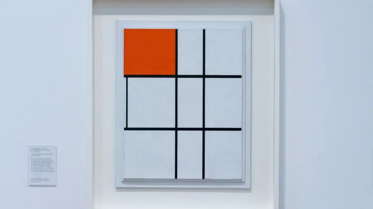
- Color: one saturated accent in a muted scene.
- Detail: sharp edges and texture at the focus, softer shapes elsewhere.
- Isolation: empty space around the subject so nothing competes.
- Scale: a figure that is clearly larger or smaller than its surroundings.
Bigger is not automatically more important. A small bright figure in a large dark room often beats a huge, evenly lit object. For palette decisions that support emphasis, see our guide to color theory for illustration.
Balance: stable or tense
The Getty defines balance as the distribution of the visual weight of objects, colors, textures, and space. It compares a design to a scale: balanced elements make it feel stable.
It also notes that symmetrical balance conveys a sense of stability, while asymmetrical balance often conveys a sense of movement because the elements are unbalanced. That gives you a practical choice.
- Use symmetry for calm, formal or monumental images, such as a throne room or a portrait.
- Use asymmetry for action, tension or a sense of discovery.
- Offset a heavy subject on one side with a lighter but contrasting element on the other.
Placing the subject off center, near a thirds line, is a common way to get asymmetry. Treat it as a starting point, not a law. Centered subjects work well when you want confrontation or stillness.
Movement: building the path
The Getty describes movement as the path the viewer’s eye takes through the work, often to focal areas. You design that path on purpose.
Tools that create it include:
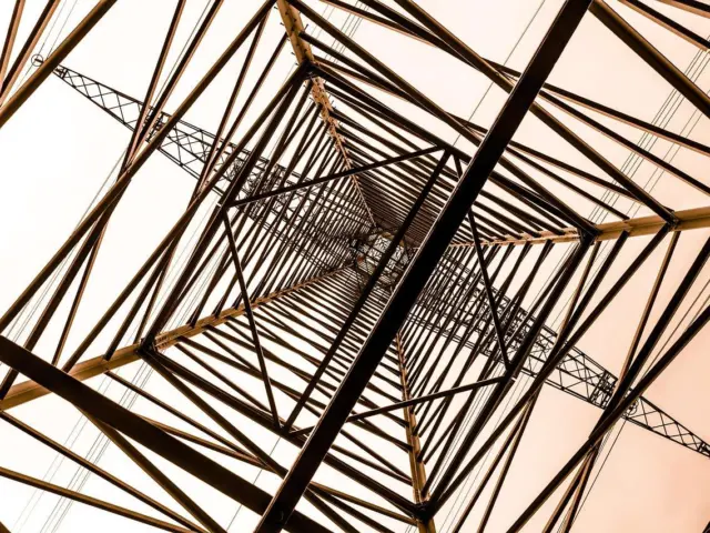
- Leading lines such as roads, rivers, arms, weapons or architecture that point toward the focus.
- Implied lines made by a row of shapes or a character’s gaze.
- Value steps, where the eye moves from dark to mid to light.
- Repetition and rhythm, which carry the eye from one shape to the next.
- Framing elements like doorways, branches or foreground shapes that enclose the subject.
Be careful with lines that run off the edge. They can drag attention out of the picture. Let them bend back in, or end them with a shape that holds the eye.
Depth also guides the eye. Overlapping shapes, size change and converging lines establish foreground, middle ground and background, and our guide to perspective drawing covers how to build that space convincingly.
Matching composition to the story
Layout is not only decoration. It tells the viewer how to feel before they read a single detail, so choose it to match the story of the image.
A lone character dwarfed by a vast landscape suggests isolation or awe. The same character cropped tightly, filling the frame, suggests intensity or discomfort. Neither is correct in general; each fits a different intent.
Think about the relationship between your subject and the space around it:
- Lots of empty space gives a feeling of quiet, loneliness or scale.
- Tight cropping raises pressure and urgency.
- Low viewpoints can make a subject look powerful, while high viewpoints can make it look small or vulnerable.
- Diagonals add energy, while horizontals feel restful.
For concept art, this matters even more. Your picture often has to communicate a setting, a character and a mood at a glance, so the hierarchy of information must be clear.
Try describing the image out loud in the order the eye reads it. If your description jumps around or begins with something minor, rearrange the shapes until the spoken order matches the story you want to tell.
A thumbnail workflow and common pitfalls
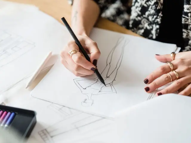
Good composition is decided early, when changes are cheap. Work small and fast before committing to a finished piece.
- Draw a handful of tiny thumbnails in flat gray, using only three values.
- Mark the focal point in each one and check that it has the strongest contrast.
- Trace the path your eye takes. Fix any spot where it stalls or leaves the frame.
- Pick the clearest thumbnail, then refine it at a larger size.
- Squint at it again before adding color and detail.
Keep the thumbnail stage separate from rendering. It is far easier to move a shape in a quick sketch than to repaint a polished scene.
Common mistakes to avoid
- Equal emphasis everywhere: if every area has the same contrast and detail, nothing leads.
- Tangents: edges that just touch, creating awkward visual tension.
- Dead center by default: placing everything in the middle without choosing to.
- Crowded edges: bright details near the border that pull the eye away.
- Ignoring the silhouette: a readable outline helps the subject survive at small sizes.
Another habit worth building is studying finished work. Pick an illustration you admire, then sketch only its big shapes and value pattern. Note where the contrast is strongest, which lines point inward and how the artist balanced heavy areas with light ones.
Repeat that exercise with a few different styles. You will start to see the same decisions behind very different pictures, and those decisions become easier to reuse in your own work.
When a picture feels wrong, ask what the eye does first, second and third. Then adjust contrast or placement until the answer matches your intent.
Frequently asked questions
Is the rule of thirds required?
Show answer
No. It is a guideline for off-center placement, and many strong illustrations ignore it. Use it to test options, then choose what serves the focal point.
What is the difference between emphasis and movement?
Show answer
Emphasis is the area that catches attention, while movement is the path the eye takes toward it and around it, according to the Getty’s definitions.
Does a focal point have to be the largest element?
Show answer
No. Contrast in value, color, detail or isolation often matters more than size.
When should I use symmetrical balance?
Show answer
Use it when you want stability, formality or calm. For action and tension, asymmetry usually works better.