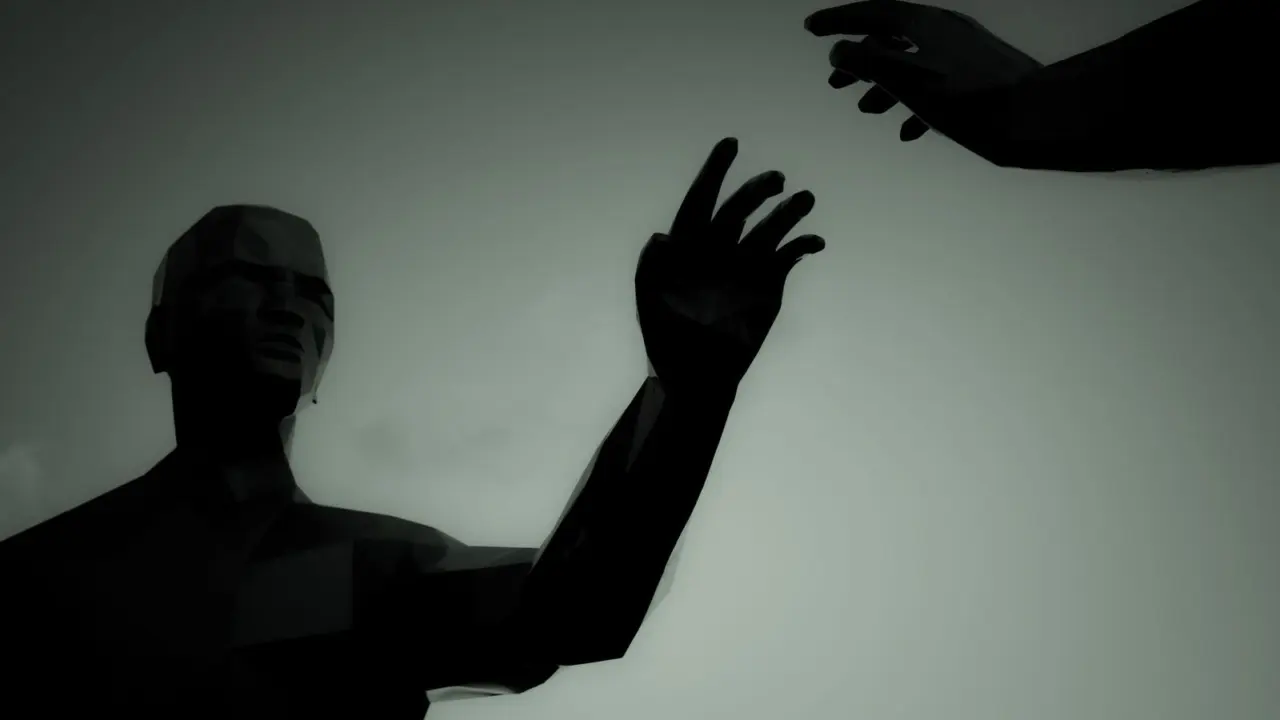
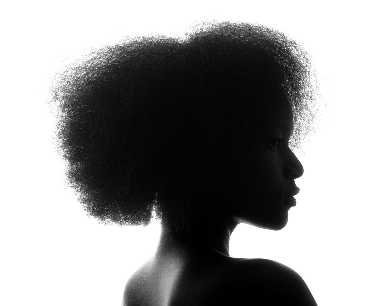
If your characters blur together once the colour and detail are gone, silhouette design is the fix. Squint at the solid black shape: if you can still tell who it is and what they do, the design works.
This guide is part of our wider look at concept art, and it focuses on one habit that makes designs read faster.
| Item | Value |
|---|---|
| Team Fortress 2 character classes with distinct silhouettes | Nine |
| Elements designed to shape each silhouette | Body proportions, weapons, footwear, hats and clothing folds |
| How silhouettes are emphasised | Rim highlights rather than dark outlines |
| Interior clothing folds | Designed to echo silhouette shapes |
| Test result reported by the designers | Characters identifiable with no internal shading at all |
The figures come from the Valve paper Illustrative Rendering in Team Fortress 2, a Valve document. Details can change or be revised, so check the source before you rely on them.
What a silhouette does in a design
A silhouette is the outer contour of a character or object, read as a flat shape. It can help viewers recognise a design without colour, texture or facial detail.
That makes it a practical test. If two designs look alike when filled with black, viewers may need colour or internal detail to distinguish them.
Concept artists use the check in three ways:
- Identity: can you tell the characters apart?
- Action: does the pose show what the character is doing?
- Role: does the shape hint at personality, such as heavy, nimble or sinister?
A case study: nine classes, nine shapes
Valve’s Team Fortress 2 is the clearest published example. The paper explains that the player’s class matters a great deal to gameplay, so the silhouettes of the nine classes were carefully designed to be very distinct from one another.
The designers report that even when viewed only in silhouette with no internal shading at all, the characters are readily identifiable to players. That is the goal of the exercise: recognition without help from colour or detail.
Players of fast, crowded action games have only a moment to read a figure. A strong outline can help players recognise a character’s class; other cues may be needed to distinguish allies from enemies.
The tools that build a strong silhouette
The Valve paper names the ingredients. In its words, the body proportions, weapons and silhouette lines determined by footwear, hats and clothing folds were explicitly designed to give each character a unique silhouette.
You can turn that into a checklist for your own work:
- Proportion: vary the size of the head, torso, arms and legs. Characters with the same build are hard to separate.
- Props and weapons: a large or unusual held object changes the outline immediately.
- Headwear and hair: the top of the shape can provide a distinctive recognition cue.
- Footwear and legs: boots, heels and bare feet each change the base of the shape.
- Clothing: capes, folds, belts and sleeves break up straight edges.
Shape language helps too. Round, soft forms tend to feel friendly, while sharp, angular forms tend to feel dangerous. This is a convention of the craft rather than a measured rule, so treat it as a starting point.
Keeping interior detail in service of the outline
A good silhouette does not mean the inside is empty. The Valve designers took the opposite view: in the shaded interior areas, the clothing folds were explicitly designed to echo silhouette shapes.
The paper adds that silhouettes are emphasised with rim highlights rather than dark outlines. It also says high-frequency detail is omitted where possible, which keeps the gross shape readable.
Valve’s artists credited the commercial illustrators who inspired the look, noting those artists drew with strong, distinctive silhouettes and clothing folds. A Game Developer report on a Valve talk quotes an artist calling silhouette “a building block of character design” that is “identifiable at first read”.
Common silhouette mistakes
Most weak silhouettes fail for a few predictable reasons. Spotting them early saves a lot of repainting.
- Tangents and merges: an arm that blends into the torso, or a prop that sits exactly against the body, hides a key shape.
- Everything the same size: when every part has a similar width, the figure becomes a column with no rhythm.
- Detail doing the shape’s job: a logo or pattern cannot rescue an outline that looks like three other characters.
- Symmetry by default: perfectly mirrored shapes feel stiff, and an asymmetric element such as one large pauldron or a single raised tool adds character.
- One pose only: a design that reads when standing but turns to mush mid-action will cause trouble later.
None of these rules is absolute. A deliberately plain, rounded silhouette can be exactly right for a quiet, gentle character, as long as it differs from the others in the same cast.
The useful question is always comparative: does this shape stand apart from its neighbours? A design that would be fine alone can still fail beside a near-identical sibling.
How to test your own silhouettes
You do not need special software. A pencil, a marker or a digital brush filled with solid black is enough.
- Sketch a batch of rough shapes before refining any one of them. Fast thumbnails let you judge shape without being tempted to add detail.
- Fill each shape with solid black and line them up side by side.
- Shrink them to thumbnail size. Shapes that merge or lose their key features need another pass.
- Change the pose and check the shape still communicates. A figure that only reads from one angle is fragile.
- Add colour and detail only after the shape passes.
This order matters. Fixing a muddled outline late forces you to redo work, while fixing it at the thumbnail stage costs minutes.
It also helps to build a lineup. Place your whole cast in a row as black shapes and ask a friend to name each one without hints. Any shape they hesitate over is the one to rework first.
Keep a reference folder of outlines you admire, from comics, animation, games or old illustration. Studying why a shape works can help you identify useful design choices.
Beyond characters
The same thinking applies to objects, vehicles and environments. In prop design, a held item must be recognisable at a glance, often as part of a character’s outline.
When you move on to people and creatures, the character design process builds on silhouette in the same way: shape first, then costume, colour and expression.
Silhouette also supports readability in the world around the character. The Game Developer report says one Valve designer found a darker, more accurate fog made it “really hard to get that silhouette read that’s so important to the players”, so visual choices outside the character matter as well.
Frequently asked questions
What is silhouette design?
Show answer
It is the practice of shaping a character or object so that its solid outline alone communicates who or what it is. You test it by filling the shape with black and checking that it is still recognisable.
Does a strong silhouette mean less detail?
Show answer
Not necessarily. The Valve paper says high-frequency detail is omitted where possible, but interior details such as folds are chosen to echo the outline rather than compete with it.
Should I design the silhouette before colour?
Show answer
Testing the silhouette early can help you establish a recognisable shape before adding colour and detail.
Do silhouettes only matter for games?
Show answer
No. Games make the need obvious because players must read figures quickly, but animation, comics and illustration all benefit from shapes that are easy to recognise.