Stuck staring at a blank page when you want to start character design? Begin with a solid-black silhouette, then add shape language, colour and detail only once the outline reads clearly.
This guide is part of our wider look at concept art, and it walks through the order of work from first sketch to final look.
| Item | Value |
|---|---|
| Silhouette | The character filled solely with black, with colours and details removed |
| Sign of a strong design | Recognisable solely from the silhouette |
| Square forms | Stability and heaviness |
| Triangular shapes | Danger or aggression |
| When to test readability | Early, before detail, texturing or animation |
These points come from StudioBinder and RocketBrush. Teaching material changes over time, so check the sources before you rely on them.
What character design actually decides
A character is not a drawing of a person. It is a set of choices that tell the viewer who this is, what they do and how to feel about them.
StudioBinder puts it this way: every aspect of a character such as shapes, color palettes, and details are chosen for a specific reason. If you cannot say why a feature is there, it is a candidate for removal.
That habit also protects you from copying trends without thinking. A glowing eye or a spiked pauldron only helps when it supports the role you wrote down, otherwise it is decoration that competes with the shapes that matter.
Gather references before you sketch, but gather them widely. Look at real clothing, animals, architecture and historical costume, not only other characters, so your design does not become a copy of a copy.
Before you draw, write down a short brief for yourself:
- Role: hero, rival, sidekick, bystander or monster.
- Personality in three words.
- Setting and era the character lives in.
- Medium: animation, game, comic or a single illustration.
Start with the silhouette
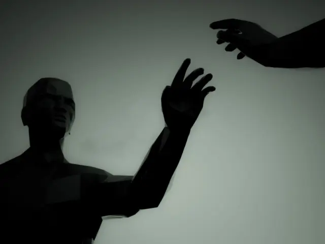
A silhouette is what is left when you remove all colours and details and fill the outline of the character solely with black. It is the cheapest test you have, because it takes seconds to try.
StudioBinder also notes that a sign of good character design is a character being recognisable solely from their silhouette. Fill in a handful of small thumbnails, then pick the ones that look different from each other.
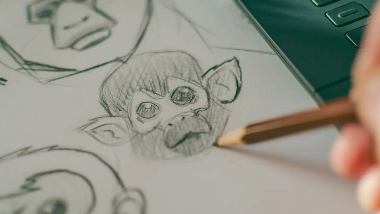
Variety matters more than polish at this stage. If every thumbnail has the same stance, the same bulk and the same head shape, you have one idea drawn many times, not many ideas.
Try changing one thing per row: the overall height, the width of the shoulders, the size of the head, or the position of a big prop such as a staff, a backpack or a cape. Big changes to the outer shape are far easier now than after you have rendered the folds of the clothing.
Our guide to silhouette design goes deeper on this step, including how to push a shape without breaking the anatomy.
A quick thumbnail routine
- Draw many tiny outlines in one sitting, without detail.
- Fill each one solid black.
- Shrink them to thumbnail size and squint.
- Keep the two or three that read fastest and are most different.
Use shape language to carry personality
RocketBrush describes shape language as using basic forms (circles, squares and triangles) to communicate personality, function and visual intent. Each shape has built-in associations.
In the same article, square forms convey a sense of stability and heaviness, while triangular shapes suggest danger or aggression. Circles are generally read as soft and friendly.
- Circle: soft and approachable, a fit for a healer, a mascot or a child.
- Square: stable and heavy, a fit for a guard, a brute or a mentor.
- Triangle: dangerous and sharp, a fit for an assassin, a villain or a trickster.
Treat the list as a starting point, not a law. Mixing shapes is normal: a knight might have a square torso, a round helmet and triangular shoulder spikes, and each part says something different. A friendly giant can be built from squares, and a sinister clown can be built from circles, because the contrast is the point.
RocketBrush gives a game example: a tank character with a wide, blocky silhouette and low centre of gravity, a fast enemy with sharp, angular shapes and a forward-leaning posture, and a support unit with softer, rounded forms and a more upright stance.
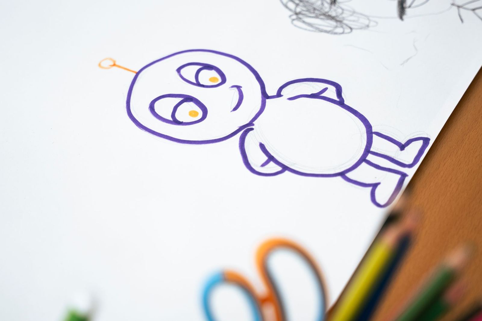
Layer in proportion, colour and detail
Once the outline works, adjust proportion. Large heads and big eyes tend to feel youthful, while long limbs and small heads can feel elegant or unsettling.
Then limit your palette. A few dominant colours plus one accent make a character easy to recall and easy to repaint in different lighting.
Detail comes last. Add it where the viewer should look, usually the face, hands and any signature prop, and keep the rest quiet.
Costume is where a design gains history. Worn boots, patched sleeves, a missing button or a family badge suggest a past without a line of dialogue. Choose materials that fit the setting, since leather, cloth, metal and fur all catch light differently and affect how the shape reads.
Expression and posture matter as much as clothing. A character who slouches reads differently from one who stands tall, even when the outline is otherwise identical. Draw your character in a relaxed pose, an angry pose and a surprised pose to find out whether the design still feels like one person.
- Pick one feature to exaggerate, such as the nose, shoulders or hair.
- Repeat a motif in clothing and props so the design feels unified.
- Make sure the accent colour sits on the part you want noticed first.
Common mistakes to avoid
Most weak designs fail for a few repeat reasons. Knowing them lets you catch problems while they are still cheap to fix.
- Too much detail too soon, which hides a weak outline behind rendering.
- Every shape the same, so the character looks generic and blends into a crowd.
- Too many accent colours, so the eye has nowhere to land.
- No clear role, so costume and props pull in different directions.
- Designing only the front view, then discovering the back is empty.
When you are unsure which problem you have, go back a step. Start with the full design, remove detail, then turn it into a solid-black silhouette, checking readability at each stage.
Test, revise and place the character in a world
RocketBrush advises that readability should be tested early, before the team moves into detail, texturing or animation. Run the same test again after colour: shrink the image and check you still know who it is.
Next, draw a turnaround with front, side and back views, plus a few expressions and poses. That sheet is what lets other people, or future you, keep the character consistent.
Add a small colour key and a few close-ups of any detail that is easy to forget, such as jewellery, a scar or the pattern on a fabric. Label anything unusual so that nobody has to guess later.
Ask a friend to look at the finished sheet for a few seconds and describe the character back to you. If their description matches your brief, the design is communicating. If it does not, change the shape or colour that caused the mismatch, not the explanation.
Finally, put the character against a backdrop. A strong design can vanish into a muddy scene, which is why environment design and character work should be checked together.
Frequently asked questions
Should I draw the face first?
Show answer
Usually not. Work out the whole-body outline first, then refine the face once the overall shape and role are clear.
Do I need to follow shape language rules strictly?
Show answer
No. They are common associations, and breaking them on purpose can create memorable contrast, such as a gentle character built from sharp forms.
How do I know a design is finished?
Show answer
When it reads in silhouette, stays recognisable at small size, and every feature has a reason you can state in a sentence.
Can I use these steps for three-dimensional characters?
Show answer
Yes. RocketBrush recommends testing readability before texturing or animation, so the same silhouette checks apply before modelling in detail.
How many versions should I draw before choosing one?
Show answer
There is no fixed number. Keep going until you have a few outlines that are clearly different from each other, then develop the strongest one.