Staring at a long list of brushes and unsure which to pick? Digital painting brushes come down to a few types and five or six settings: hardness, opacity, flow, spacing and pressure response.
Brushes live inside your painting program, so see our guide to digital art software for choosing one.
| Setting | What it does |
|---|---|
| Hardness | Hardness: round brushes only |
| Opacity | Opacity: lower number means more transparent strokes |
| Flow | Flow: how fast colour builds under the brush |
| Spacing | Spacing: distance between each nozzle point |
| Pressure | Pressure on size and opacity: small, light strokes at low pressure |
These descriptions come from the Wacom community guide to Photoshop brushes and the Affinity Photo for iPad help page. Menus and names change between versions, so check the source before you rely on them.
The main types of digital painting brushes
Most programs offer the same families under different names. Knowing the family tells you what a brush is for before you try it.
- Round and hard-edged brushes: for line work, sketching and crisp edges.
- Soft round brushes: for gradients, glows and blending skin or sky.
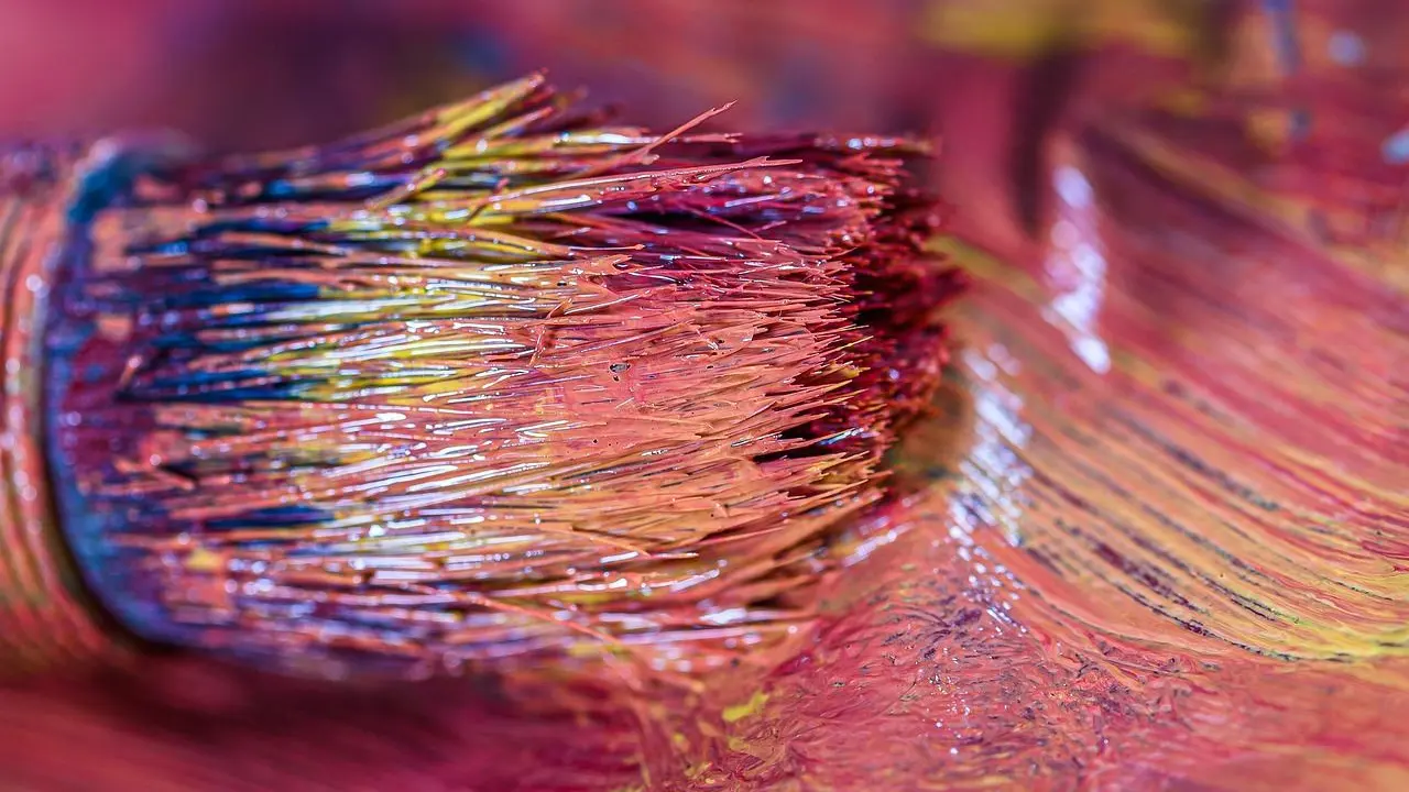
- Textured brushes: imitate chalk, charcoal, canvas grain or bristles.
- Blending or smudge brushes: move or mix existing colour; some also add new colour, depending on their settings.
- Stamp brushes: scatter leaves, grass or stars along a stroke.
A beginner can paint a whole picture with one hard round, one soft round, one textured brush and a smudge tool.
Hardness, opacity and flow
These three decide how a stroke looks on the canvas. Hardness sets edge sharpness, and in Photoshop it applies to round brushes only, according to the Wacom guide.
The same guide says hard brushes, especially at high flow, create a drawing effect, whereas soft ones, especially at low flow, are best for smooth blending.
Opacity caps transparency: a lower number means your strokes will be more transparent. Flow is described as a smoother version of opacity made just for painting, intended to mimic traditional paint. Affinity’s help adds that flow controls how fast colour builds up under your brush.
Spacing and pressure response
Spacing sets the distance between each point a brush stamps along your stroke. Affinity’s help says a lower percentage lets the points blend together into a flowing stroke.
Raise spacing and you get dotted lines, which is useful for stamp or texture brushes but not for smooth painting.
Pressure response links your pen force to a brush property. The Wacom guide notes that pressure can control size and opacity together, so low pressure gives a stroke that is both small and light-colored, like a pencil compared to a pen.
Choosing and tuning a brush for the job
Change one setting at a time and test on a scrap layer. That way you see what each slider really does.
- Pick the brush family that matches the task, such as a hard round for line work.
- Set the size for the area you are painting.
- Lower flow or opacity for soft build-up and glazing.
- Lower spacing if the stroke looks dotted.
- Adjust the pressure curve until light and heavy strokes feel natural.
- Save the result as a custom preset.
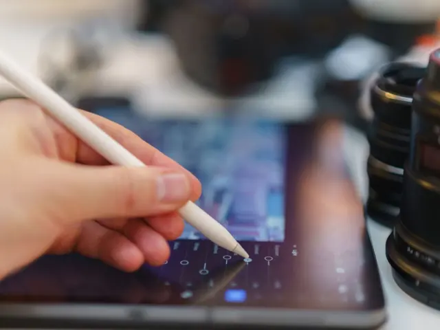
Your hardware matters too. A tablet without tilt or pressure support limits what a brush can do, and the guide to ipad for digital art covers one popular option.
Why brush settings feel different from real paint
A real brush loads with paint, runs out and changes as it dries. Many digital brushes build strokes from repeated stamps, with settings that simulate paint behaviour. That is why opacity, flow and spacing exist as separate controls.
Think of each stroke as a row of small marks. Spacing decides how far apart the marks sit, flow decides how much colour each mark adds, and opacity decides how strong the finished stroke can get. Once you see the stroke this way, odd results become easy to diagnose.
Pressure then acts as a remote control. You can attach it to size, to opacity, or to both, and each choice changes how your hand feels on the pen. Try each in turn and keep the combination that matches how you naturally draw.
Practical brush workflows for painting
Settings only matter once they serve a stage of the painting. The following stages offer one possible workflow, with suggested brushes for each.
Blocking in shapes
Start with a hard round brush at full opacity. You want clear, confident shapes, so keep pressure response on size only and let the edges stay crisp. Lowering hardness here tends to turn everything to mush before the forms are settled.
Building form and soft transitions
Switch to a soft brush and lower the flow. Because flow lets colour build up gradually, you can layer a gentle gradient across a cheek or a cloud without visible stroke edges. Pressure linked to opacity makes this feel natural, since a light touch deposits a light veil of colour.
Adding texture and detail
A textured brush breaks up the digital smoothness. Use it sparingly on surfaces such as rock, fabric or paper grain. Save the sharpest hard round for last, for edges and highlights that need to catch the eye.
Blending and cleaning up
A smudge or blending brush pulls existing colour along the stroke. It works best with a low strength, so it softens a transition without wiping out the paint underneath. Overusing it is a common reason a painting looks airbrushed and flat.
Common brush mistakes and how to fix them
Some brush problems can be resolved by adjusting settings. Check these first before you download new packs.
- Strokes look dotted: spacing is too high, so lower it.
- Everything looks blurry: hardness is too low for the task, or a smudge brush is being overused.
- Colour never gets dark enough: flow or opacity is set too low, or pressure is mapped too lightly.
- The pen feels twitchy: your pressure curve is too sensitive for your hand, so soften it.
- Brush feels laggy: large sizes and heavy textures can slow some programs, so try a smaller size or a simpler brush.
Many artists collect a huge library of brushes and still return to a few favourites. A small, well-tuned set is faster to use and easier to learn from than a huge folder of presets.
Using brushes across programs
Brush names and panels differ, but the core settings above appear in most painting software. If you are leaving one program, our look at photoshop alternatives for digital painting shows where your habits will carry over.
Brush file formats are often not compatible between programs, so expect to rebuild a favourite brush from its settings. Writing down the size, flow, spacing and pressure values makes that easy.
Frequently asked questions
Should I buy brush packs?
Show answer
Not at first. Learn what hardness, flow, spacing and pressure do on the default brushes, then add packs only when you know what is missing.
How many brushes do I need?
Show answer
Very few. A hard round, a soft round, a textured brush and a smudge tool cover most work.
What is the difference between opacity and flow?
Show answer
Opacity sets how transparent a stroke is. Flow controls how fast colour builds up under your brush, so it feels more like real paint.
Why does my brush stroke look dotted?
Show answer
Spacing is probably too high. Lower the percentage so the stamps blend into a continuous stroke.
Does hardness work on every brush?
Show answer
Not always. In Photoshop, hardness applies to round brushes only, as of the Wacom community guide’s description.